Changes in Adult Social Care Demand
- COVID-19 has had a significant impact on people receiving and providing adult social care.
- Demand for new assessments has increased when comparing 2019/20 to 2020/21.
- Increases in support experienced not only via First Contact, but also directly into main providers.
- Demand also increased, not only from people living in the community, but also those being discharged from hospital.
New assessments – April 2019 to April 2021
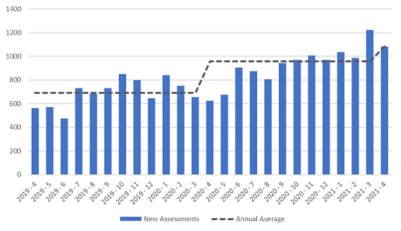
Source: Staffordshire County Council, Operational Intelligence & Performance Team
In addition, there is an evident shift in the types of adult social care support being provided.
- Overall numbers of long term service users has fallen.
- More specifically nursing and residential service users have remained below pre-COVID-19 levels. In contrast community users are showing an upward trend, with home care service users now at a rate above pre-COVID-19 levels.
Nursing/Residential care
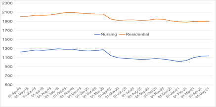
A line chart comparing “Nursing” and “Residential” figures over time from around March 2018 to March 2022. The y‑axis ranges from 700 to 2,300. Two lines are shown: a blue line for Nursing and an orange line for Residential.
The Residential line remains consistently higher, starting just above 2,000, peaking around 2,100, and then gradually declining to just under 1,900 by the end of the period. The Nursing line starts around 1,200, rises slightly to about 1,250, then drops sharply around early 2020 to near 1,100, before stabilising and edging back up to around 1,150 by the end.
Overall, the chart shows a gradual downward trend in Residential figures and a dip followed by partial recovery in Nursing figures.
Community care
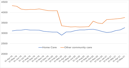
A line chart comparing “Home Care” (blue line) and “Other community care” (orange line) from around April 2018 to March 2022. The y‑axis ranges from about 2,000 to 4,500.
The orange “Other community care” line starts high at around 4,300, gradually declines to about 4,100, then drops sharply around early 2020 to roughly 3,300. After this drop, it fluctuates and rises again, ending near 3,700–3,800.
The blue “Home Care” line starts around 3,100, shows minor fluctuations, dips to just below 3,000 around early 2020, then gradually increases again, ending at approximately 3,200–3,300.
Overall, the chart shows a sharp decline in “Other community care” around early 2020 followed by partial recovery, while “Home Care” remains more stable with a slight dip and gradual upward trend toward the end.